ShopDreamUp AI ArtDreamUp
Deviation Actions
~ Special Supporter ~
Your support would mean a lot to me :)
Here you will find your picture, illustrations and much more, everything can be downloaded freely.
Support my work by contributing to my tip jar every month.
$1/month


Suggested Deviants


Suggested Collections


You Might Like…


Description
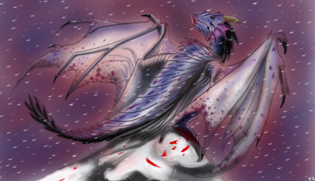
I made two versions of this picture but was not sure which one was best so I asked my friends on Facebook and they picked this one. The other can be found in my gallery. They're basically the same but this one had a redder background and kind of adds more of an atmosphere to it, like there's fire behind the snow clouds.
Image size
2954x1696px 836.5 KB
Comments5
Join the community to add your comment. Already a deviant? Log In
I do like this work overall, how ever I feel like there is detail in areas where it is not needed and in which case draws the attention of the eye awkwardly. For example, the lines of the wings and back are partially faded and the wing almost looks unfinished due to the edge blending with the background, where as the leg/foot under the right wing has more intense color and detail and thus draws my eye more. I like how the face is an implied focal point because it has the same features as the leg (more detail, stronger color) how ever it makes the rest of the work almost feel lacking because of how less detail and color there is in the rest of the body compared to the head. I am a very large fan of the color palette you decided to use for this but I think tweaking some of the highlights and shadows on the dragon will help it to better stand out from disappearing into the background (such as the tail almost tends to do, if not for the strong black shadow on the tail, i wouldn't have noticed it
Something that can give this dragon a VERY neat effect is to highlight and shadow each individual scale going down its back instead of one continuous highlight line, because we can clearly see they are not part of one plane like a snakes scales, maybe give it a practice run to see how it looks <img src="e.deviantart.net/emoticons/w/w…" width="15" height="15" alt="